Creating an ecosystem of solutions empowering entrepreneurial chefs to serve customers with a personalized and memorable customer experience.
My Role:
Business Liaison, UX Researcher
Duration:
December 2022 - January 2023
Team
4 members

Authentic Kitchens
Project Brief:
Authentic Kitchens, based in Texas is a local platform that connects professional private chefs with customers around their area.
As their clientele grows the company is seeking to prioritize CRM features before launching a redesigned platform to integrate various customer processes.
Discovery:
First things first - we needed to understand our starting point. The first step was diving deep into research around the current catering market and Authentic Kitchens website. We used information we pulled from studies and reviews that Authentic Kitchens shared with us and conducted Maze surveys and interviews to gather data. Here is some qualitative data from the audit:

Customer surveys received on current status of the catering service market from a study conducted on Maze.
Chef interviews conducted from the pool of Authentic Kitchens' chef network.
Customer interviews conducted from the pool of contacts from the market survey.


User Personas:
In order to remain user focused throughout our design we built out two user personas from the information we gathered through research and interviews.


Problem Statement:
Summarizing the business, the chef's and the customers needs and frustrations as they relate to Authentic Kitchens' catering service in a concise statement. These statements set the tone and direction for research and design moving forward.

HMW:
Keeping the problem statement and business goal in mind, we could start asking ourselves how to solve for the challenges we've identified to help transition to the design stage.


Comparative Analysis:
For our comparative analysis we chose LinkedIn, Facebook and Etsy because these companies align with the AK brand statement. With our analysis we found that all three companies as well as their users benefit from both the chat and messaging options for easy communication accessiblity we used this information and incorporated these options in our design.


Ideation & Usability:
What solutions can we create to develop an MVP (Minimal Viable Product)?
-
Understand the connection between chef and customer in Authentic Kitchens
-
Redefine the meaning behind this connection based off the design narrative
-
Workshop solutions with Authentic Kitchens staff

Defining Authentic Kitchens' core values:
ECO SYSTEM = NEIGHBOURHOOD (community of the customer vs chef)
EMPOWERMENT = FLAME WITHIN
(in the food(heat); work (chef); life)
MEMORY = TASTE (warmth of nostalgia)
What does authentic mean to you
“Grounded yet sophisticated”
Defining Flame: there is a spectrum between red to blue
Scientific definition of flames
Red flame = safety flame
Blue flame = powerful
UX definition of flame
Red > alert, call to action
Blue > trustworthy; safe; secure

Sketches:
We had a crazy 8 sketching session with the Authentic Kitchens stakeholders and the design team in order to gain insight and ideas to implement in our initial design that were in alignment with our stakeholders desires and expectations.

Initial Designs, User Tests Results and Iterations:
The original designs were tested in order to discover areas of success and improvement through moderated and unmoderated user tests.

Chef Flow:

User Goal: Reply to a customer message
Misclick: 83.9% Time Spent: 18.03s Testers: 5
83.9% users selected top right corner button for messages.
Solution:
Add notification on messages at the top left bar
Change path to top right corner and add welcome screen prior to dashboard.
Quotes:
"When trying to respond to the messages I was trying to click the message icon in the top right with the red notification."
"I ended up clicking on the upper mail icon instead of the messages link just my initial habit of what I do."

User Goal: Post a new promotion blast
Screen Metrics: Misclick 86.4% Time Spent: 24.29s Testers: 9
86.4% users clicked the wrong starting point spread out through various areas: top right drop down, dishes, and icon (refresh to home).
-
When viewing the current wireframe, the orders button is the correct path but the next frame suggests the promotions are under dishes.
Solution:
Create path for dishes instead
Deliberate the purpose of the 'orders' tab and what it be re-worded to
User Goal: Check customer response data
Screen Metrics: Misclicks: 94.8% Time Spent: 51.17s Testers:5
94.8% users did not know where to find the analytics for promotion messages, and many users expressed (seen below) that "messages" was not an expected action button for the task.
Solution: Create separate section for promotional blasts vs. messages (for analytics purposes)
Create new button for analytics
Quotes:
"Did not know what button/tab to click at first (selected 'review' button first)"
"When searching for analytics, I did not expect it to be under 'messages'. I was kind of expecting it under settings or. different tab.
"I was looking for the option on the left navigation and couldn't click on it so I almost gave up. Then I just went into the 'messages' and saw the 'Promotion' on subject like and clicked on that. This part was confusing because I didn't think to go into mailbox to find it."
I didn't realize that the promotional analytics were in the messages so it took me a minute to find them.
"As a chef, I would find it useful. Seemed well thought out."

Customer Flow:

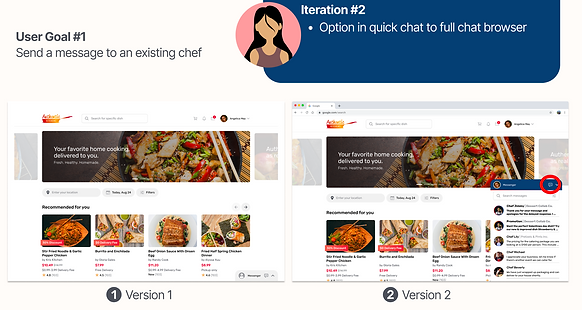
User Goal: Sending a message to an existing chef
Misclick: 75.0% Time Spent: 11.06s
75% users selected the top right button to begin the flow
Solution:
Make top right button primary button for flow
Quotes:
"I did nothing that there is notification here. I would just like I was mentioning before, expect that to be clickable. I'm not sure if it would open up another tab or again. Now I would even say, maybe remove this completely from the top. Maybe like if your message is always going to be persistent there but it's just a little bit strange that there's notification that can't click on."
User Goal: Respond to promotion blast
Misclick: 84.6% Time Spent: 5.15s
84.6% users were unable to open the bar for the promotional blast along the bottom
-
Users attempted to select the unread promotional message on the right
-
Users tried to close the message chat
Solution:
Make unread messages along the bottom a different color
Unbold the promotional blast after opening it
Automatically close other chat boxes when opening a new one.

Color and Font Stats:


Chef Site Iterations:


Recommendations:

Style guide color refinement and alignment with the branding.
